branding.
Bringing a Cotswold town’s Past present and future to life though a full re-brand.
Evesham has a hugely rich history, so it was a complete joy to tell these stories through their branding and inspire both visitors and the local population alike.
The bespoke wordmark was inspired by an old shop sign found in the archives; its serif details echoed the shape of asparagus leaves, a reference to the town’s reputation for producing asparagus. It therefore represents both the town’s heritage and present day offering.
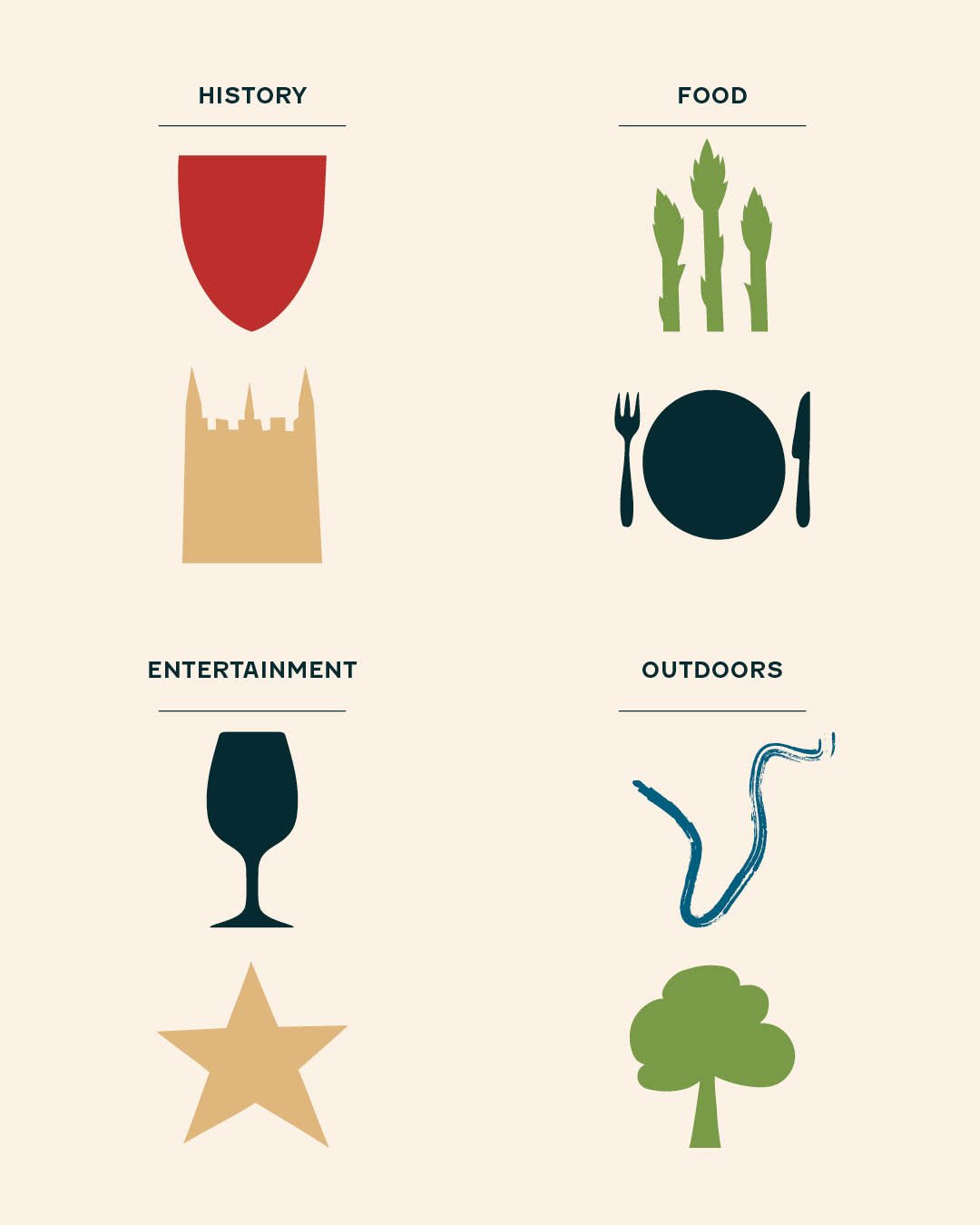
A suite of versatile graphic devices was created to give Visit Evesham a clear sense of ownership, colour, and structure across the wide variety of assets they produce. Each one tells its own story, bringing to life the elements that make Evesham such an inviting place to visit.
As with the graphic system, the colour palette is rooted in elements of the town, from the red of William de Montfort’s shield at the Battle of Evesham to the sandstone of Evesham Abbey. Having a suite of colours that can unify the town’s identity whilst adding vibrance and warmth felt key to the success of the project.