branding.
Helping Revolution Bars encourage their core audience to ‘Dare to be Different’.
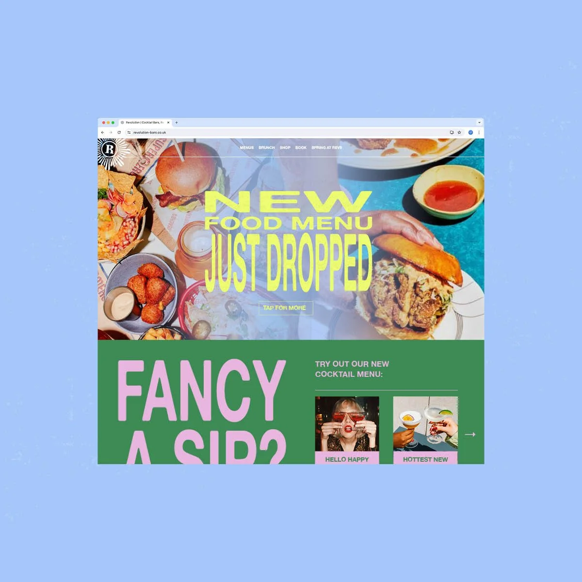
Off the back off some insightful strategy from the fantastic Upside Down, it became clear that the more disruptive the Revolution rebrand was, the more it would resonate with its audience.
The result is an identity that throws the traditional rules of design out: stretched type, clashing colours and exaggerated proportions in compositions. I knew we were onto something when creating the brand assets started to feel genuinely rebellious.
It’s been great to see how Revolution has rolled out the new identity through its use of typography, colour, and the new strobe-flash photography style. Head to their website to see the re-brand in action.