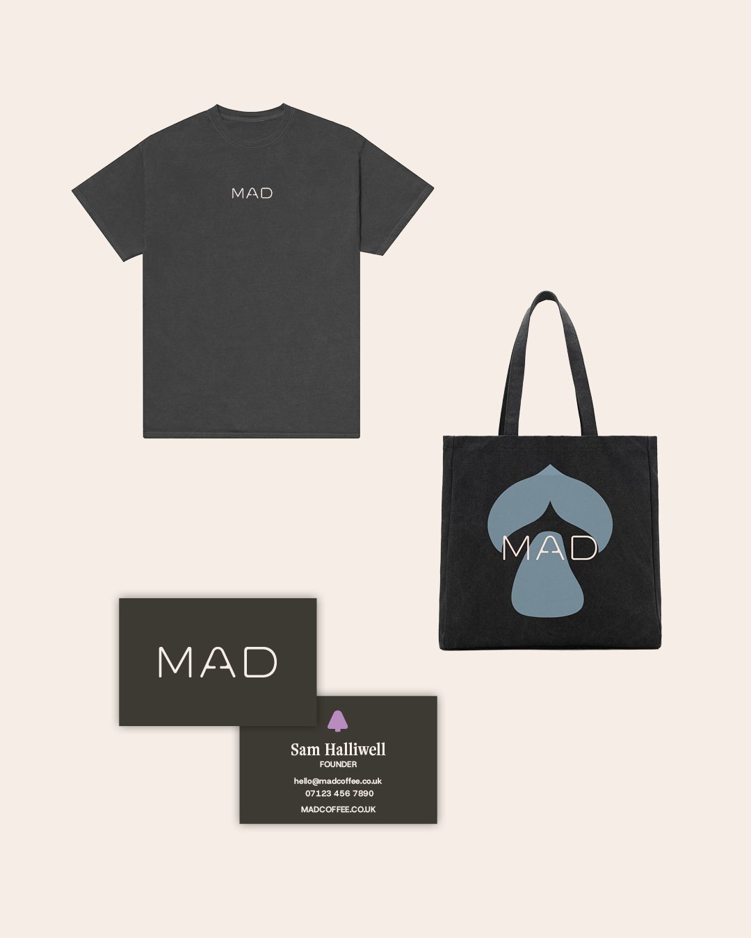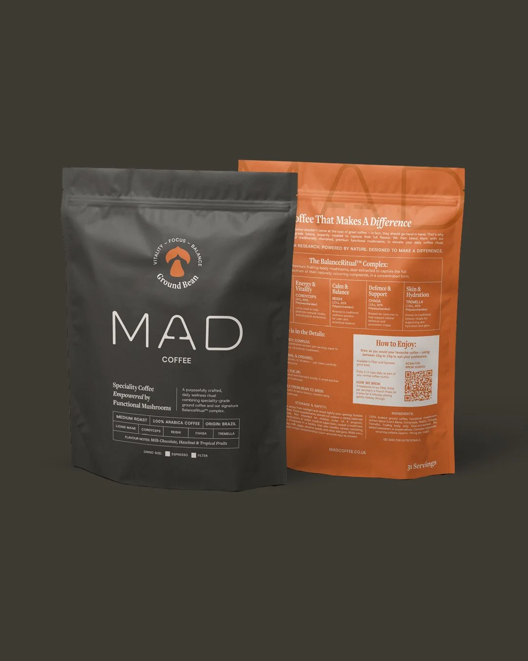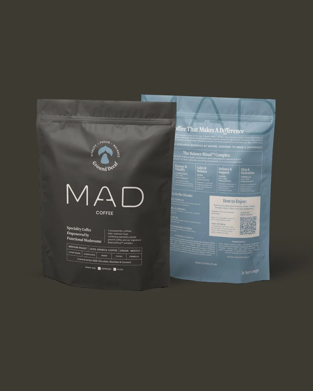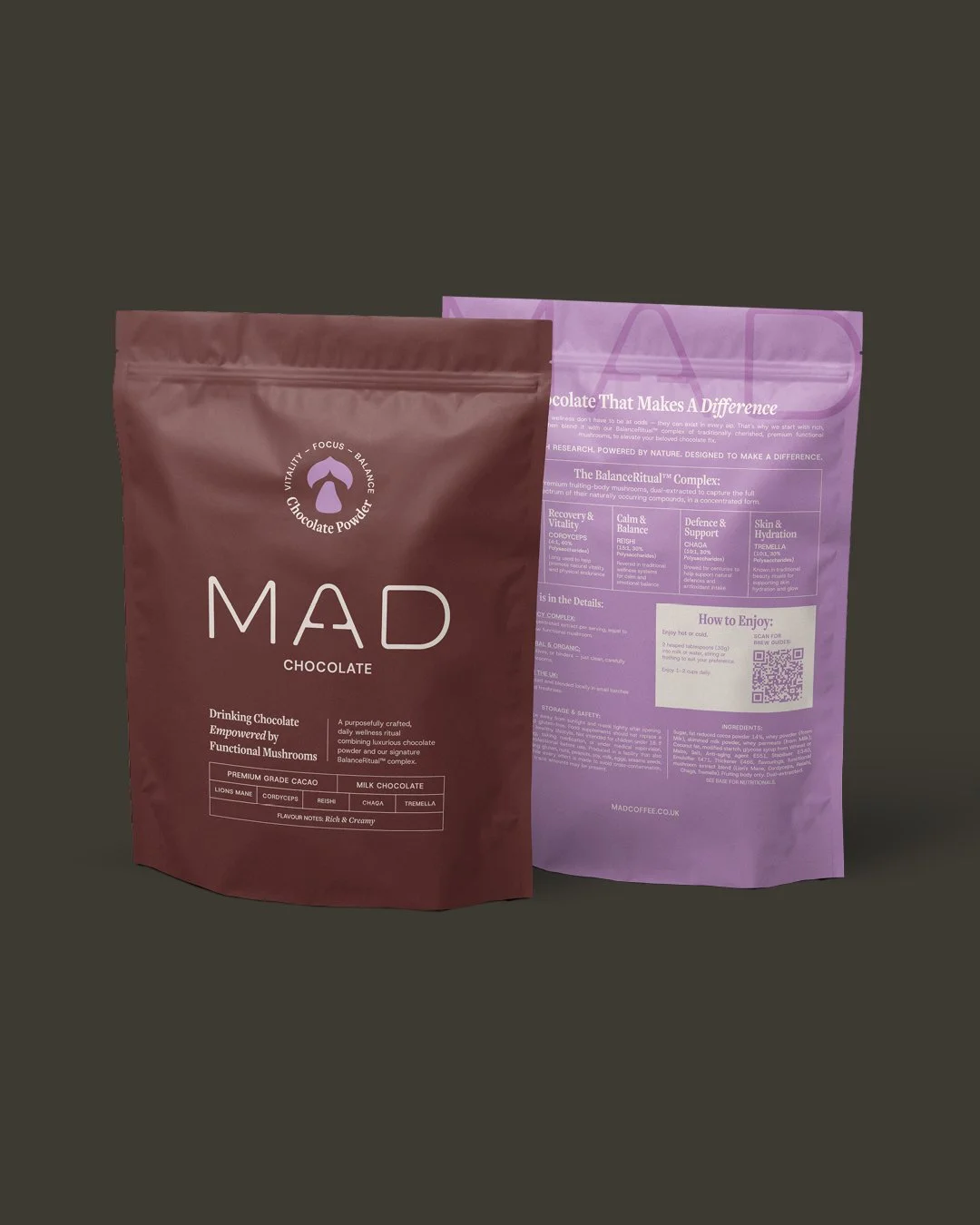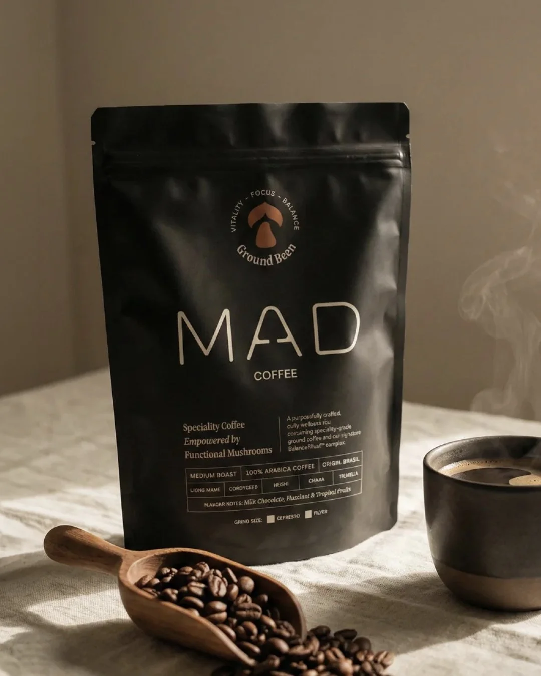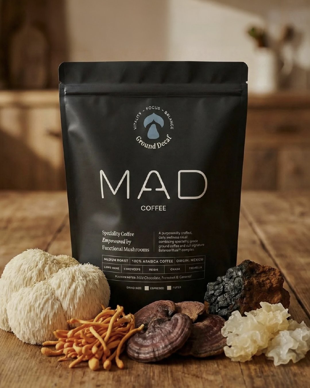
branding.Packaging,
Getting the balance right for a coffee brand that doesn’t let nootropic benefits get in the way of taste.
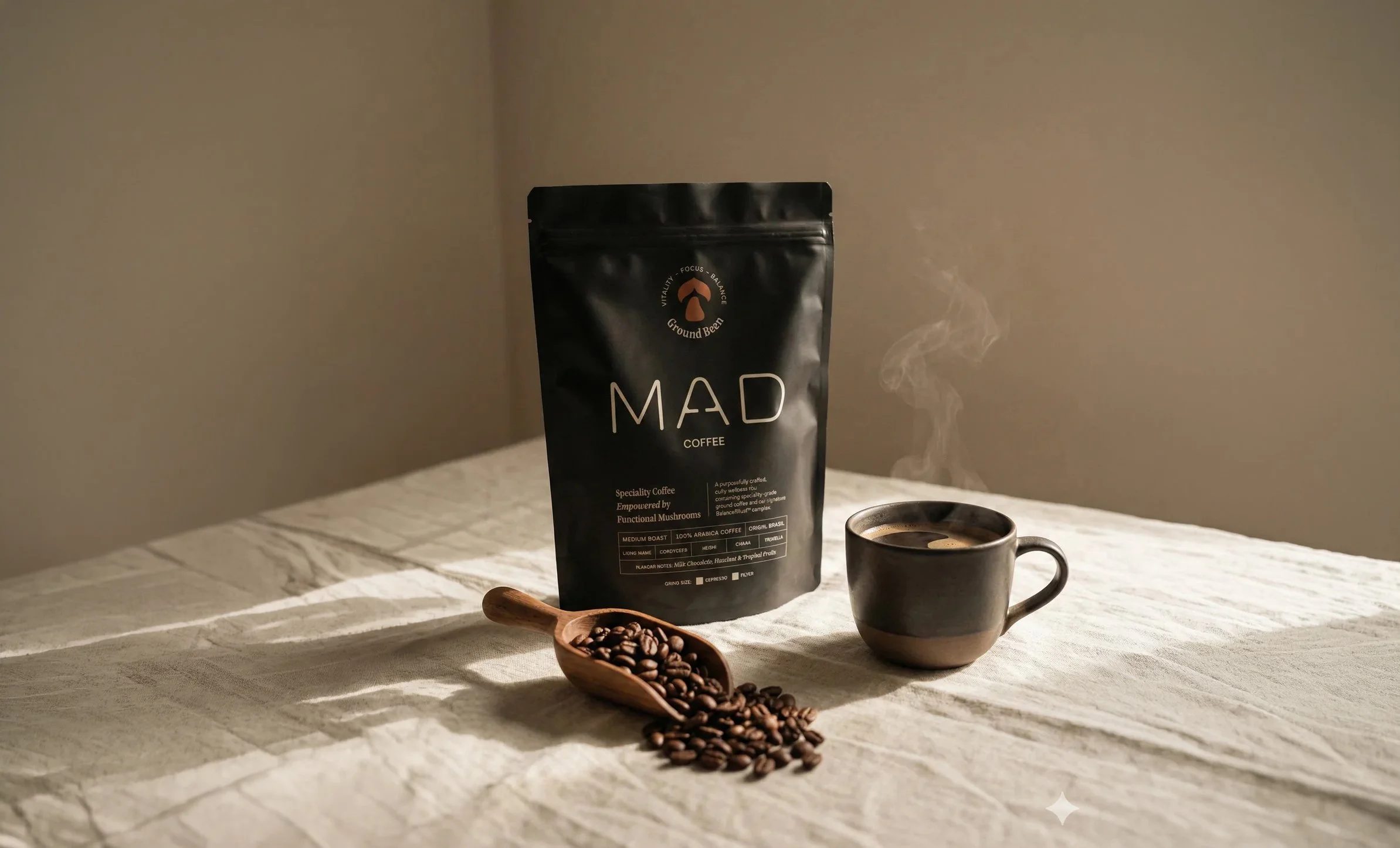
As MAD coffee were repositioning themselves and their products to be Nootropic focussed, they needed a new brand that reflected the change.
The brief was to create an identity that was both premium and bold, and balanced the scientific with natural elements.
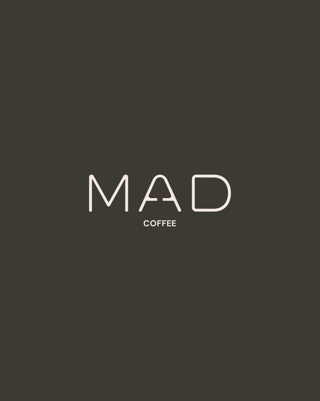
The result was a clean, minimal wordmark that incorporates a mushroom into the “A”, typography that mixes serif and sans serif depending on the messaging, and core off-white/black brand colours that contrast with the warm pops of colour.
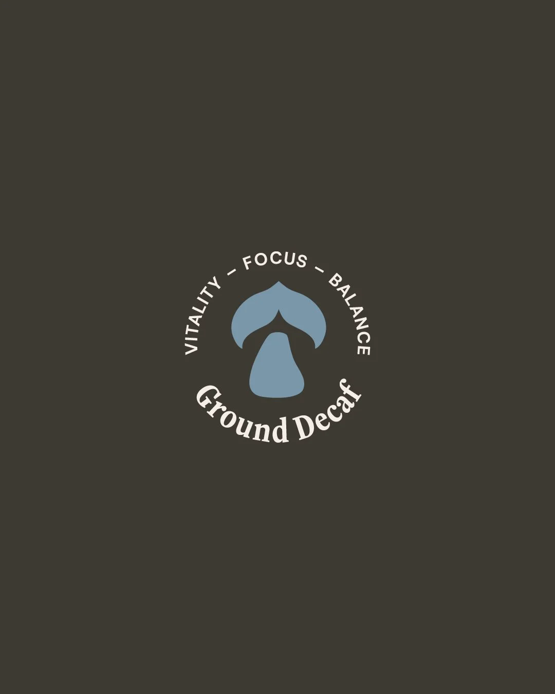
Another element from the branding is the product icon that companies a mushroom with latter art, symbolising the product in a concise graphic.