branding. WEB DESIGN.
Eccentric Branding for a Family home with real character and stories to tell.
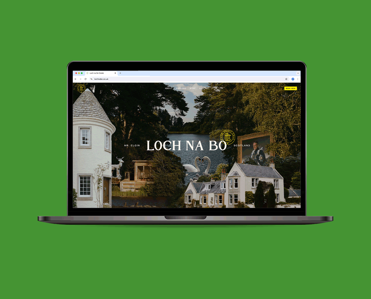
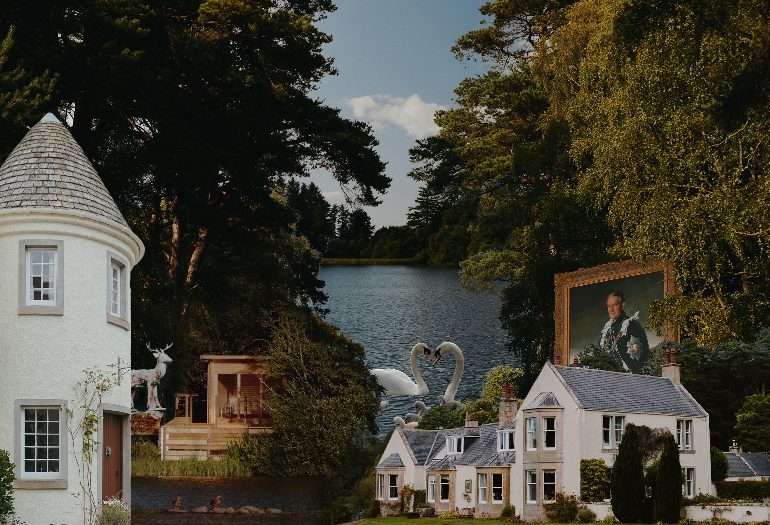
It’s always fun to work on a brief where the client wants to challenge conventions, and Loch Na Bo was a great example of that. A beautiful and characterful place deeply rooted in family history, the challenge was letting this shine through in the most authentic way possible.
The combination of the hand-made feel of the typography and the 80s-inspired colour palette matches the eccentric feel of the interiors. Using collages of the stunning photography taken by @barney_curran created a surreal charm within the imagery and helped tell the story of everything on offer to those renting the house.
It was important to use the branding to tell specific stories. The pop of yellow is inspired by a story of the clients’ grandfather walking around the Loch in a yellow coat so he could easily be spotted by his wife, while the floral pattern is lifted from the fantastic array of wallpapers found throughout the house. The house is filled with details and bespoke features, so the design needed to mirror this.