branding. digital. print.
Creating a brand that is as unique as the guitars being made.
Daisy from Tempest Guitars has been studying and practising her craft for a number of years. When it eventually came time to start her own brand, the pressure was on to create a visual identity that could bring to life what she had spent so long working towards.
The creation of the identity was an on/off 6-month process of conversations and deep research into both competitors and what it meant to be a premium brand with a timeless feel.
The result is a brand that Daisy felt best represented her and the instruments she crafts. As a female luthier, she already stands out in a male-dominated profession, which allowed more freedom to question what a guitar brand could look like.
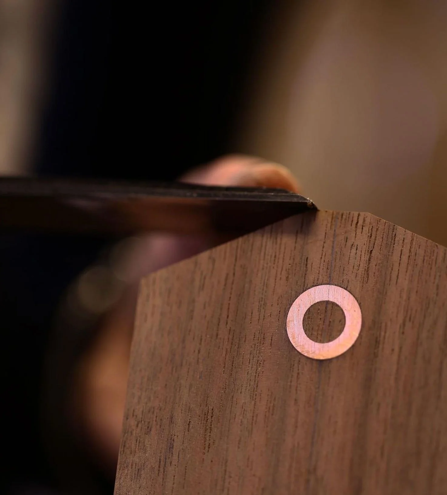
The icon is an abstraction of a guitar sound-hole meaning the guitars themselves don’t feel overly branded, given that they are bespoke instruments. Whilst the colours and typography give a premium, eccentric feel to the rest of the identity.
Visit the website here.